Loading...
July 22, 2014#

snacks n’ strokes — july 29

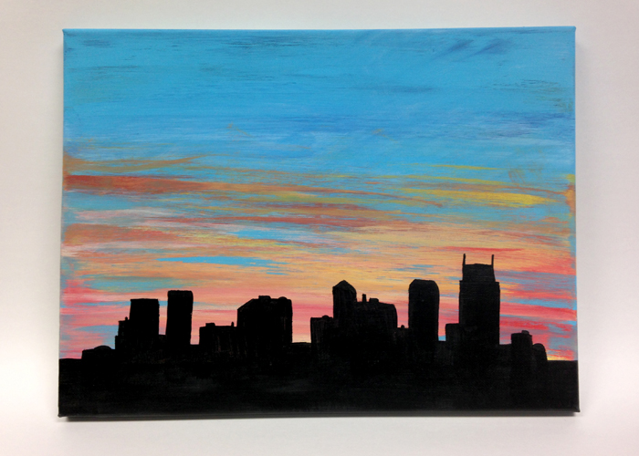
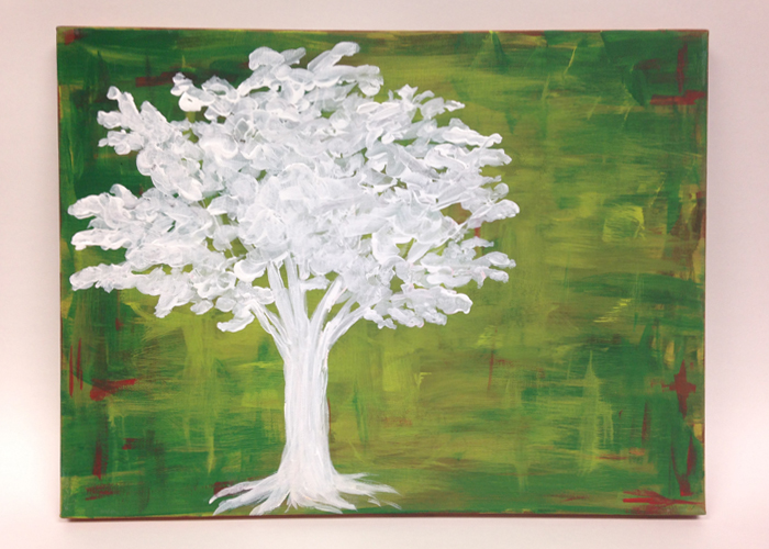
Come paint a masterpiece and eat like royalty at Snacks N’ Strokes on Tuesday, July 29, to raise money for the American Heart Association!

It’s a $20 minimum donation (per person) to join me, the fantastic Amanda Dyer and any friends and family you invite as we walk through the painting process to create either a 16×12 bold Nashville skyline or a homemade nature scene. Don’t consider yourself an artist? Have no fear! Amanda and I are excited to glide you through the process while you dine on delicious treats!

options:


This event is open to all — So, invite your friends, family and coworkers and make a night of it! We will be meeting at 5:30 pm at the Immanuel Nazarene Church off Charlotte in west Nashville on Tuesday, July 29, so just come on over after work prepared to paint!

RSVP here so we can be prepared with your snacks and art supplies!

All supplies will be provided. You will go home with a wonderful new work (created by you!) to spruce up that wall that just needs a little something at home. Or, hey, this could be a perfect gift for that loved one’s upcoming birthday. Who doesn’t love a handmade painting as a gift!

So, come give to a great cause and eat snacks and paint. It’s gonna be fun. And again, no skills necessary. We’ll ease you into it before you even realize you’ve created something cool!

Here’s that RSVP link one more time, and yeah, we’ll see ya there.
Godspeed, wonderful friends.

April 16, 2014#

uncle progress – both hands fundraiser round 2


Alright folks…
Watch the video, get emotional, donate some cash and help bring the Hays’ cool little guy or gal home.
Donate button

(Read more about the project here).

March 25, 2014#

uncle progress — both hands fundraiser

Both-Hands-Logo

show some love
Hey friends — My sister and bro (in law), Lindsey and Jonathan Hays, are patiently waiting on news of their upcoming Ethiopia adoption. (Meanwhile they are also having a baby this summer.) I’m about to launch to Uncle Level 2 and couldn’t be more excited about it.

For the adoption, they partnered with Both Hands — This great organization who helps bring home orphans (with money) and serve widows (with people). The idea is like those fun runs we did back in elementary school. Will you sponsor me while I work on this widow’s house kinda thing (instead of run laps around the school).

We will be sprucing up the home of one Ms. June, a lovely woman in Franklin, TN who unfortunately lost her husband 13 years ago. Then of course, the generous donations head 100% toward the expensive adoption process to bring Adelaide’s future cousin home.

Please consider sponsoring Kelly and me to “serve a widow to bring home an orphan.”

Way more info, a classic Keoni K pic of Linz and Jonathan, and the donate button found over here at bothhandsfoundation.org/jonathan-and-lindsey-hays. Or just…
Donate button
“Pure and faultless religion is this: to look after orphans and widows in their distress.”
–James 1:27

March 13, 2014#

mms to sms

mms-to-sms

No, I’m not talkin’ text message technology…

I’m talking about my new full-time role starting Monday, March 17 at SMS Holdings as Associate Creative Director! It’s definitely bittersweet to leave the brilliant minds over at Mankin Media Systems in Franklin, but this opportunity popped up and several prayers later feels like the right fit!

I have really enjoyed my time and work as Communications Director at MMS, and I am very thankful for the opportunity I’ve had here to learn and work alongside some truly amazing people. I think about 99% of my work from Mankin Media is better kept offline. (It’s all strategic and intentional, and probably shouldn’t have a home out here online where competing eyes can visit).

But — I am excited to apply what I’ve learned to this new creative marketing role at SMS. And of course, I’m very enthused to work with the incredible folks at SMS once again!

That’s right, for anyone following along, this move brings my career trajectory to:
MTSU –> SWM –> MM –> SMS –> MMS –> SMS.

I truly just can’t get enough of “M” and “S” business names.

December 18, 2013#

2013 favorite environment design

Astounded at the depth and originality behind a lot of environment creation this year.

I know these are all over the board, but here are the environments that inspired me most this year. Hope to capture the energy and magic found in these in future worlds I create.


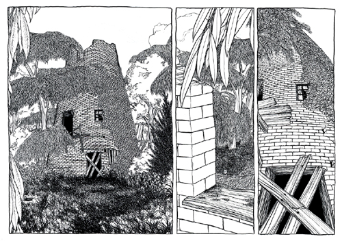
7. Richard Shaw – In a Flat Land  — a wordless comic with a Myst-like sense of exploration and discovery, in an intricate environment and landscape with a heavy emphasis on line.
in-a-flat-land


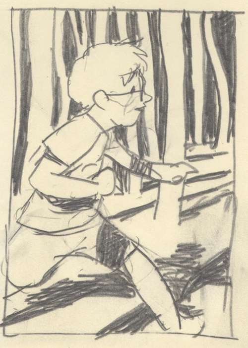
6. Sam Alden – Hawaii 1997 — Sam tells a story with his environments better than anyone I’ve found. The quick, messy pencil work in his Hawaii 1997 comic reflects the hazy memory of a childhood vacation. The blurred POV scene as the protagonist removes his glasses after jumping in the ocean? Brilliant. My favorite though is Sam’s use of light and shadows to bring life into his worlds.
hawaii 1997


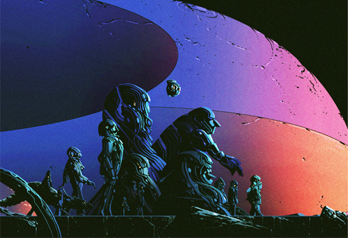
5. Kilian Eng – various — Kilian Eng environments absolutely exist on their own. The scenes are built in a way that almost tell an entire history of a distant, unknown land with just one look. Actually, they often appear to simultaneously exist in both the ancient past and a far off future. Everything’s mysterious, spacey, and wonderful.
kilian eng

4. Beeple – everydays — Beeple is madness. He has and continues to make an image everyday currently for over 2,400 consecutive days. Nearly every image of which is a profoundly rich, detailed, well executed, masterpiece. It’s … I’m jealous. Working this year in Cinema 4D, his ‘everydays’ are often environment based with tons of unique geometric, sci-fi, robotic worlds to dive into.

beeple


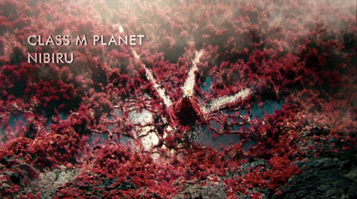
3. Scott Chambliss and team* – “Nibiru” on Star Trek: Into Darkness — Alright, I don’t know anything about Star Trek lore… But this world really caught my attention. I think it was how it shared similarities to Earth in principal (by having vegetation, a body of water, volcanic mountain, etc.) but was still quite unique in practice. I loved all the flowing red reeds. Felt like the whole world was a living, breathing thing. Part of the success here was how out of place the trek crew seemed compared to the locals. A very tribal world.
*yeah.. really don’t know who does what on movies so this is probably wrong.
nibiru


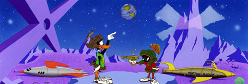
2. Tod Polson, Chuck Jones, & Maurice Noble – The Noble Approach — I’m so glad this book exists. Part tribute to the late Maurice Noble (legendary creator of animation backgrounds found in classics like Road Runner and Marvin the Martian) and part instruction and philosophy from Noble himself, this book inspires artists to really ask, “how does this background support the dialogue and story?” His sense of perspective and space is instantly recognizable and works on so many levels. In my opinion, Noble’s innovative flat designs are the forerunner to the entire flat trend which continues to spread into UI design, logos, illustrations, etc.
noble


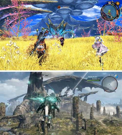
1. Monolith Soft – Xenoblade Chronicles — Okay, okay. This game came out in 2010. But it only made it to America last year and in my hands this year, and it hands down brought the most interesting and inviting environments I’ve encountered in some time. The Xenoblade worlds (called Bionis and Mechonis) make tremendous use of space. Each world is literally is a gigantic monolith, so the world tends to flow up and down instead of in a curved sphere. This allows for a really intricate balance among land masses as paths tend to float to and from each other leading gradually upward.

Besides the structure, the actual environments include everything from breathtaking waterfalls in the midst of a sun-soaked jungle hazed by heat waves to a cavernous, jagged mountain filled with icy structures reflecting the light of the night sky. Monolith Soft is currently working on what seems to be a spiritual successor, currently entitled “X” (see second pic below). Looking forward to exploring this one hopefully next year.
xenoblade

December 16, 2013#

2013 favorite music

2013 music

Here’s the thing. Made a Top 20 list of my favorite albums this year.
It was woefully obvious.
And since everybody released something this year, my list was just all the big releases (RAM, 20/20, m b v) mixed with any from my favorite artists (Silver Wilkinson, IAMACEO, Beautiful Rewind).


favorite albums

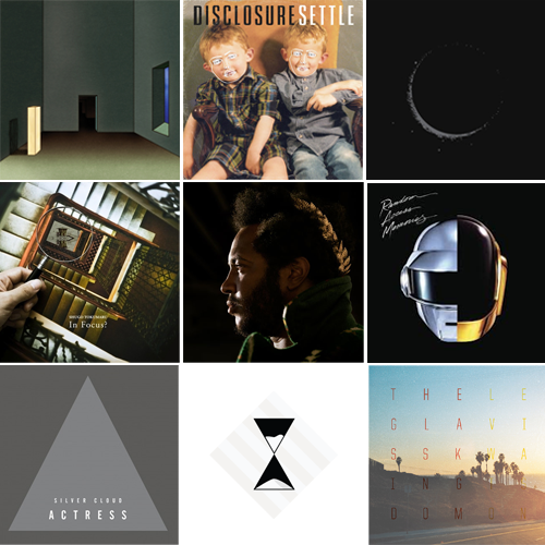
So instead of that, here’s the four that really stood out with favorite track.

4. Oneohtrix Point Never – R Plus Seven – “Chrome Country”
3. Son Lux – Lanterns – “No Crimes”
2. Disclosure – Settle – “White Noise”
1. Shugo Tokumaru – In Focus? – “Decorate”


most ‘sonic the hedgehog’ album
I’ve got a running playlist of music that reminds me of the legendary Genesis-era Sonic 1 and 2 soundtracks (by Dreams Come True’s Masato Nakamura) or the Sonic 3 soundtrack (by a bunch of people and probably Michael Jackson). Easy winner this year.

Thundercat – Apocalypse – “Special Stage”


most mesmerizing song
Heard it once and listened to this song on repeat for about 36 hours straight. Geometric track.

Actress – Silver Cloud – “Voodoo Posse Chronic Illusion”


adelaide’s favorite
Obviously, there’s a lot of old stuff to cover, but as far as 2013 goes, she sure likes to groove to…

Daft Punk – Random Access Memories – “Lose Yourself to Dance”


most anticipated for 2014
Levi Watson (Atlanta edition) is way cool. I’ve been on Neptune all year and can’t wait to visit The Glass Kingdom next year. (…may have even gotten to collaborate on this a bit…)

Levi Watson – The Glass Kingdom


Listen to most of these here on Spotify. (Thundercat = Brainfeeder release = probably doesn’t have a streaming home). Listen to Levi Watson’s last album Neptune here.

December 16, 2013#

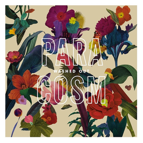
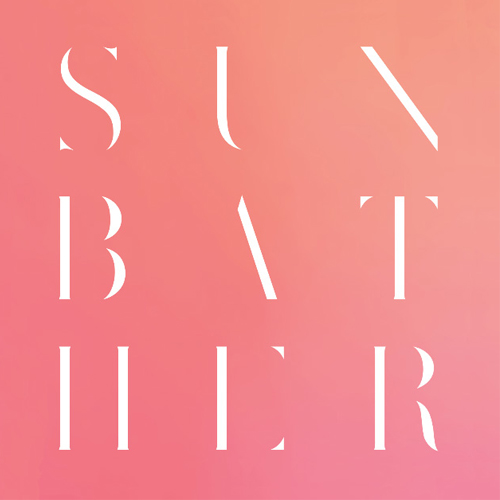
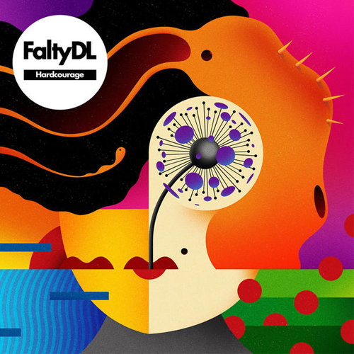
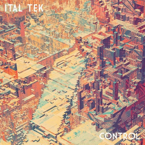
2013 favorite album art

I love great album packaging & design. It’s gotta look interesting, bring something new, and compliment the music. Here are the most inspiring (to me) this year. Well done to all the artists involved.


7. Bibio – Silver Wikinson — Album art by Bibio. Read about his process here.

bibio-silver-wikinson-album-art


6. Washed Out – Paracosm — Album art by Sara Cynwar
washed-out-paracosm-album-art


5. Deafheaven – Sunbather — Album art by Nick Steinhardt

deafheaven-sunbather-album-art


4. Anamanaguchi – Endless Fantasy — Album art by Andrew Strasser


3. Falty DL – Hardcourage — Album art by La Boca

falty-dl-hardcourage-album-art


2. Ital Tek – Control — Album art by Peter Olschinsky

ital-tek-control-album-art


1. Gold Panda – Half of Where You Live (specifically enjoyed the art for “Brazil” single) — Album art by Andy Gilmore (who is just simply the best.)

gold-panda-brazil-album-art


December 12, 2013#

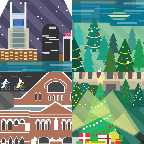
merry christmas from landslide creative!

Merry Christmas from your creative team, Amanda, Tom, Josh, and myself! Let us know how we can help bring your 2014 dreams to life!

nashville-christmas-tree

nashville-christmas-ryman-batman-building-parthenon

December 11, 2013#

christmas illustration for servicewear apparel

ServiceWear Apparel delivers high-quality uniforms and work apparel for the fine folks working in public agencies across the board. Construction, law enforcement, medical staff, etc.

Servicewear wanted a quirky Christmas card to showcase their quick turn around time (average time is less than 10 days to repair damaged uniforms, I believe) and the benefit of their “no oversize fees” stance.

I like to think Mrs. C bugged Saint Nick about trying on the ole suit months earlier and he just now gave it a whirl. Even Santa underestimates the post-Thanksgiving winter weight.

SWA-Christmas-illustration

December 10, 2013#

christmas illustration for block by block

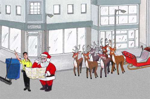
Block By Block ambassadors post up in big metropolitan areas and basically just help people. Cleaning the streets, keeping people safe, welcoming out-of-towners. It’s pretty cool.

In this case, ole Saint Nick himself gets mixed up in the big city (happens to some more often than others) and a BBB ambassador saves the day by pointing towards the next chimney. All in good fun for the BBB Christmas card of course.

BBB Christmas illustration

BBB Santa and reindeer illustration

BBB Santa Sleigh Illustration

Made with Prismacolor pencils and Kuretake brush pen. (My two absolute favorite tools this year.)

p.s. I’d post a close-up of the woman, but her left arm fades into the aether pretty fast behind that map.