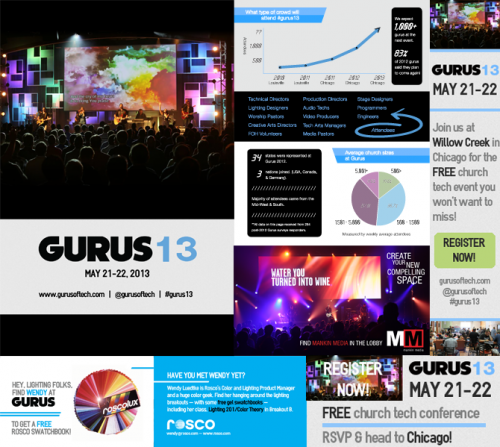
gurus live audio tour
computer, 2013
Gurus of Tech is in the midst of a short mini-tour for audio folks. It’s hosted by my friend Lee Fields (FOH for Lincoln Brewster, Audio Ninja for Mankin Media) on the new SSL Live console and hits Atlanta, Chicago, Dallas, and Nashville. I had the privilege to play art director and brand the event as the “LIVE AUDIO” Tour.
background
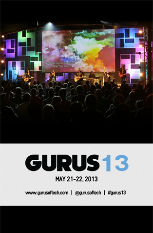
Gurus is a free conference (or in this case, a workshop) focused on connecting, teaching, and inspiring anyone working in a technical role at a church. A Gurus event (and therefore the brand itself) is typically casual, cool, and obviously very tech-oriented. This tour being a smaller, more experimental event than the big annual experience brought an opportunity to take that vibe even further.
identity
We identified a few key elements we wanted the brand of this tour to represent —
1. Rock show aesthetic
2. Cohesive with overall Gurus brand
3. Modern church feel
4. The SSL Live console (centerpiece of gear for these tour dates)
visuals
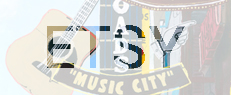
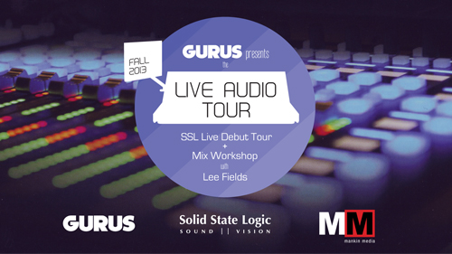
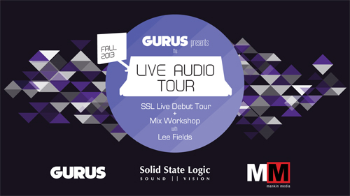
I selected out-of-focus shots of the SSL Live for background. They set the tone for audio world and the color scheme for the rest of the visuals. Each ‘logo’ or ‘icon’ is housed in an increasingly opaque circle to parallel the colors and button shapes on the console. A negative space outline of the SSL Live amps up the main logo and easily recognizable state silhouettes highlight each tour stop.
the name
Finally, the name. “Live Audio” serves strongly as both a mantra and a definition of this tour. Playing off “live” as in ‘mixing audio live’ as it’s created vs. “live” as in ‘to live your life’ kinda thing. Hopefully you instantly know the event is about mixing live audio and living in audio world. Plus, it’s easy to rally behind. #liveaudio!
promotion
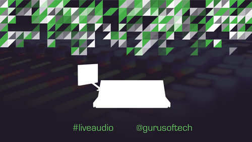
Implemented everything into a variety of web and print promo materials.
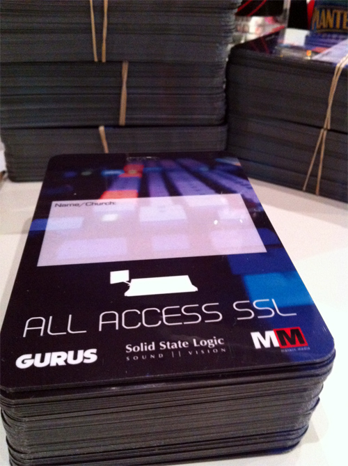
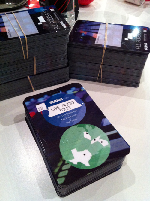
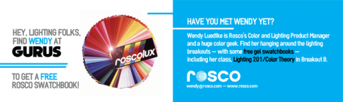
Lanyards:

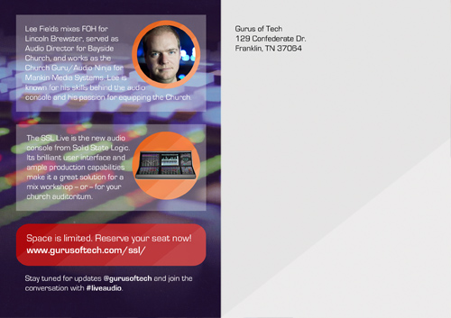
Draft of a postcard (we didn’t end up using because email promo got the job done!):
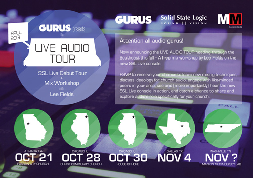
And one more digital signage image:
And finally a landing site to house it all at www.gurusoftech.com/liveaudio/.
Atlanta and the first Chicago dates have already sold out! One more date in Chicago and then on to Dallas and Nashville. #liveaudio. Check it.
 Welcome to the blog of Levi Watson, an artist and illustrator who can't stop thinking about geometry, strange worlds, and endless skies.